

Timeseries
Overview
Timeseries charts allow you to view the changes for a particular metric over time as a line graph or as a single number.
You can use these charts to answer questions such as "Is the average network request duration trending up or down?" and "Have my users been spending more time on a specific page over the past month?"
For each Timeseries type (other than Active User Count), you can create multiple "Comparisons" on a single chart which can be useful for comparing similar data points. Simply click "Add Filter" within the Comparing section and then "Add Comparison" to start comparing data!
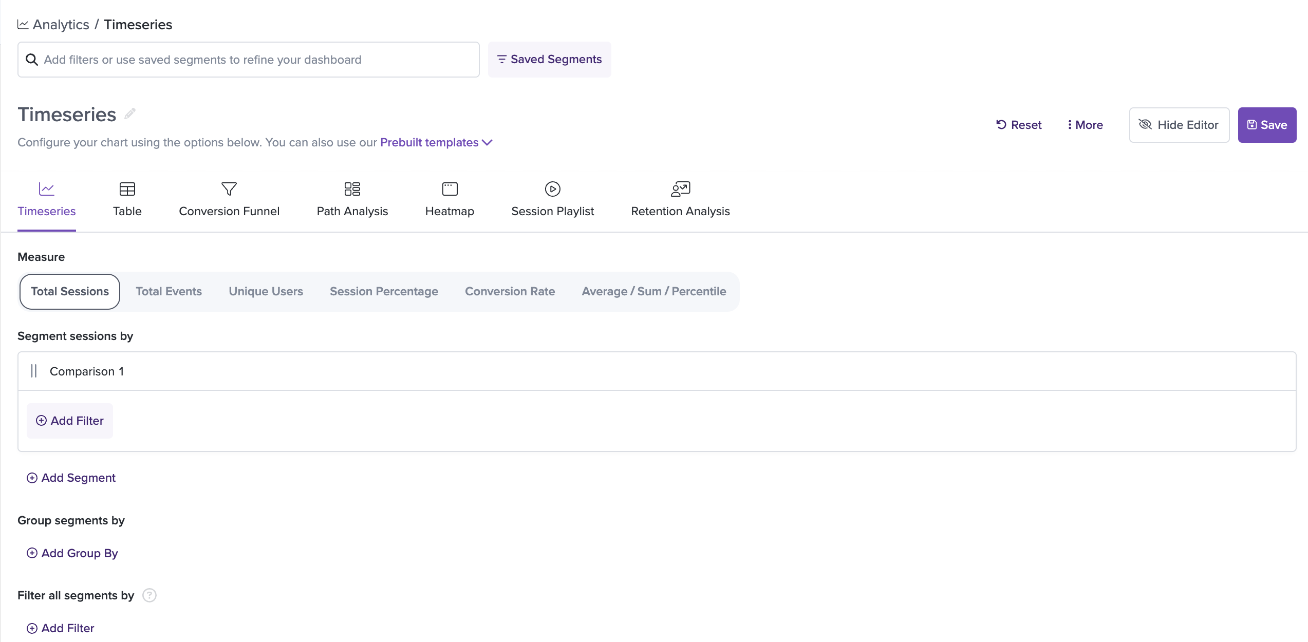
Timeseries options
Total Sessions
A Timeseries of Total Sessions will plot the number of sessions at each time interval over the selected period of time.
You can use filters on this chart to narrow down the category of sessions displayed in the chart. For example, if you are interested in seeing the number of sessions that visit a specific URL and are located in a specific country, you can add those filters below the selection of the chart type.
Group By
You have the ability to group a Total Sessions timeseries by a property using the '+ Add Group By' button. You can choose to group a timeseries by the following properties:
- Browser
- Country
- Custom Event
- Device
- IP Address
- Landing Page
- Last Visited Page
- OS
- Referrer
- Release
- SDK Type
- State/Region
- User Email
- User ID
- User Name
- User Trait
- UTM Campaign
- UTM Medium
- UTM Source
- Viewport Height
- Viewport Width
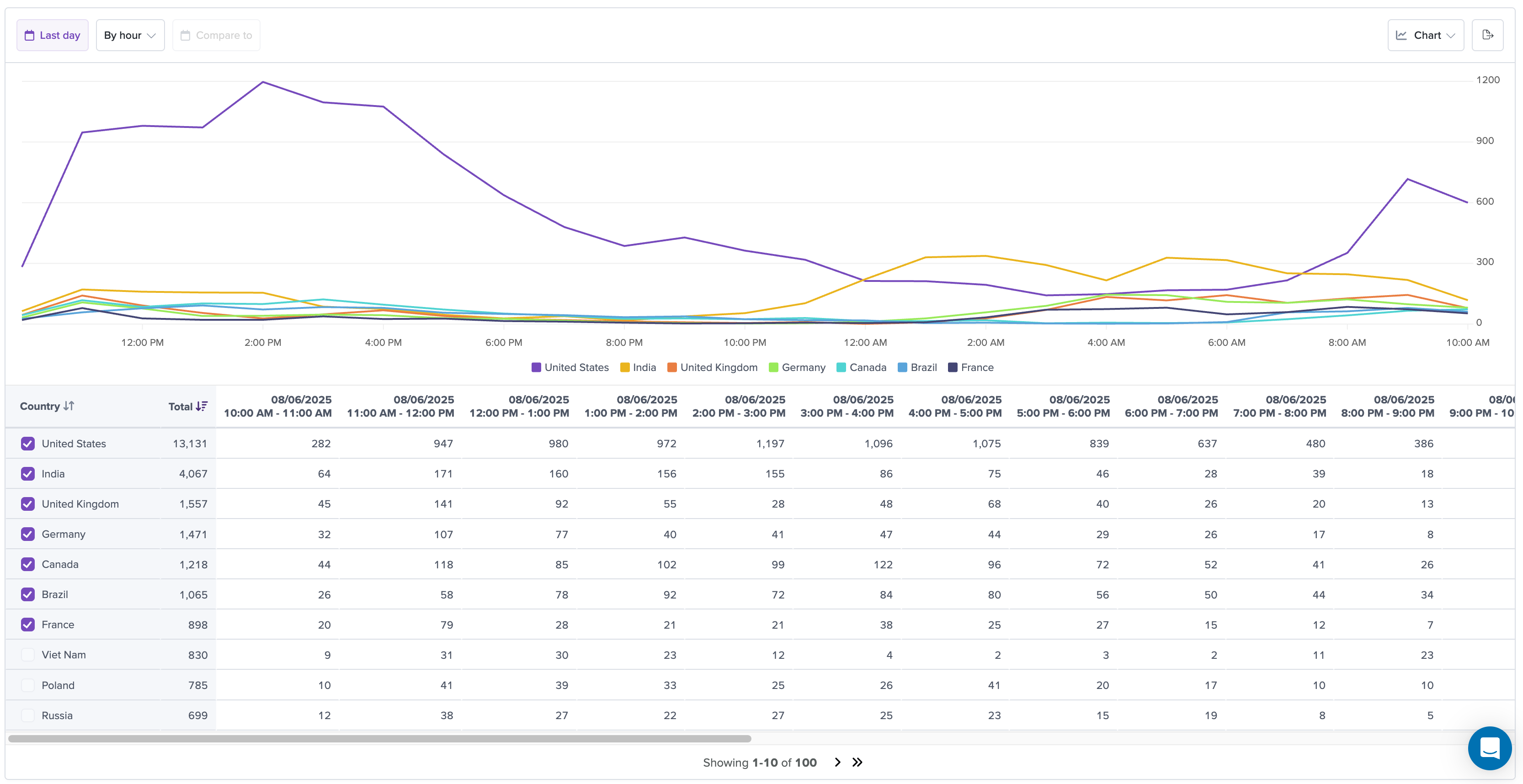
This breaks down a series by the different types within the property. You can also use the overall filter to define the data in more detail. For example, if you have a chart filter of "Clicked on text 'Home'" and apply a group-by property of 'Browser', you can see which Browser had the highest home page clicks. See below for an example.
Please note that group-by and multiple series are not supported together. If you have multiple series on a chart, you will be unable to add a group-by property.
For Total Sessions timeseries, you are able to apply up to two Group Bys. For example, you can apply 'Country' and 'Browser' Group Bys to view data broken down in groups such as "United States - Chrome".
Time Period Comparison
You can also compare a Total Sessions timeseries to the previous time period. Use the '+ Compare to' option in the top left when viewing the chart. The previous time period will be visible as a dotted line on the chart:
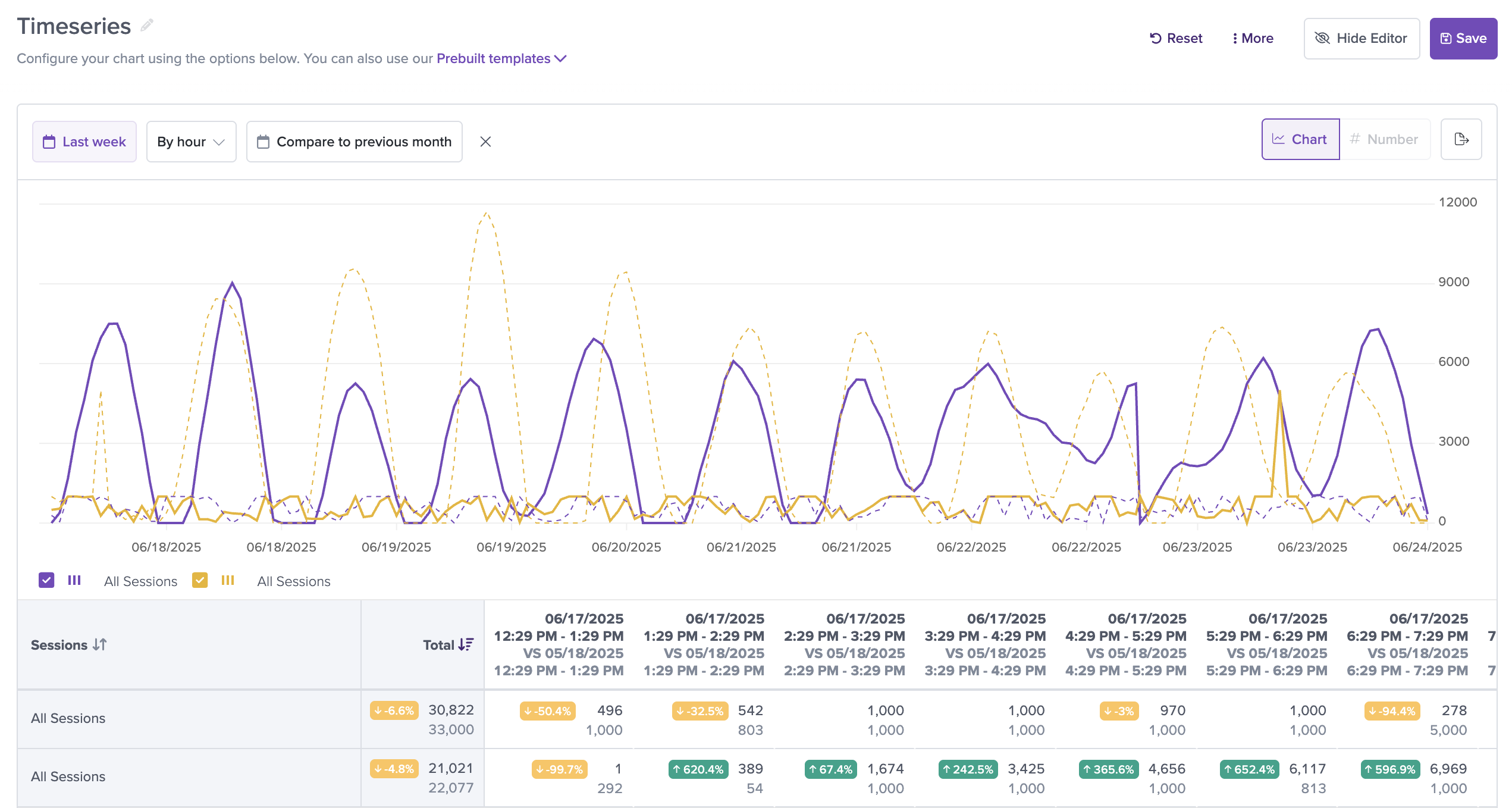
Please note that Group By and comparison time ranges are not supported together. If you have a comparison time range enabled, you will be unable to add a Group-By property.
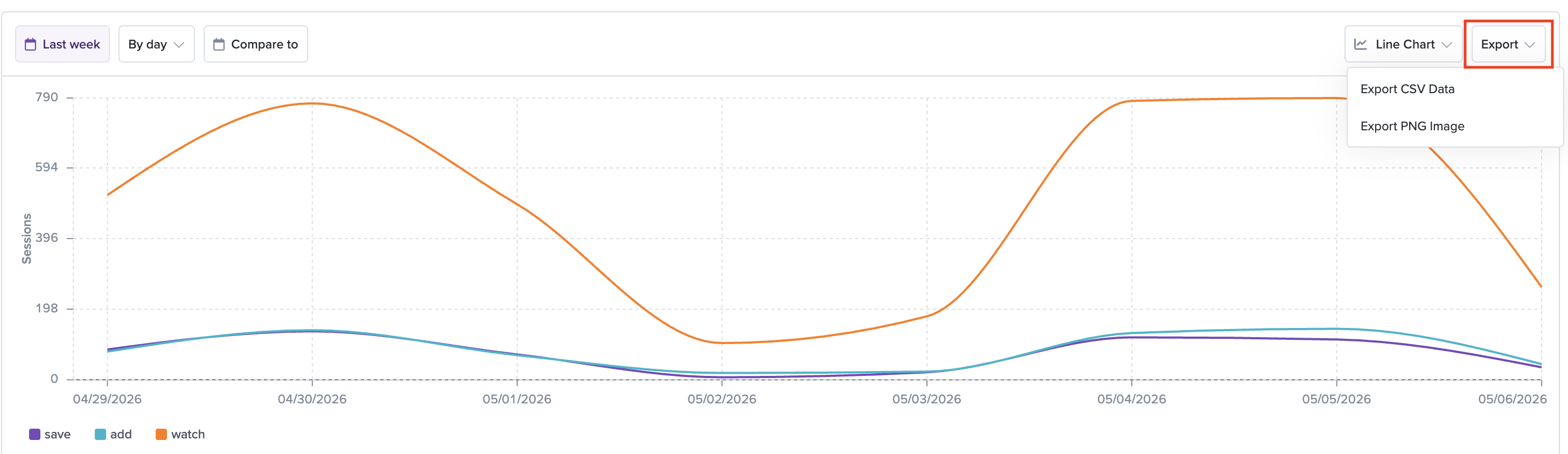
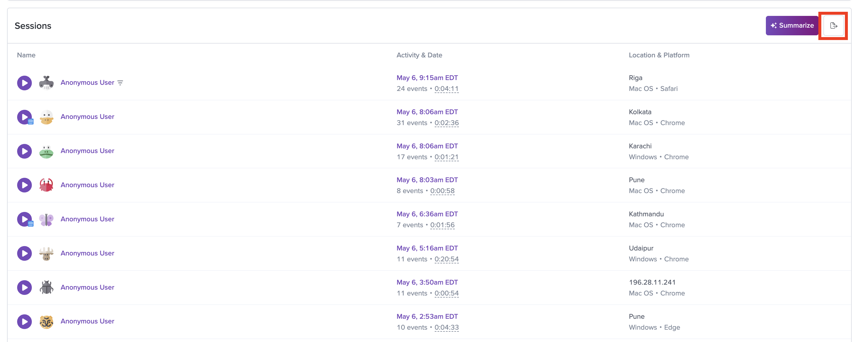
Export
You can export the data shown in the timeseries to a CSV file or PNG image. Use the 'Export' option in the top right when viewing the chart. This will export all series or group-by data for the primary and comparison time ranges.
In the exported CSV, the data is ordered by date. For intervals that are the same between the primary and comparison range, there will only be a single column with the overlapping date ranges.
You can export a CSV file of the session data from a timeseries by selecting the export icon in the top right corner of the session list. The export will include the following data for each session:
- User ID
- Timestamp
- Event Count
- Session Length
- OS
- OS Version
- Browser
- IP Address
- Session URL
Total Events
A Timeseries of Total Events will plot the number of events at each time interval over the selected period of time.
Currently we support Custom Events, Clicks, Page Views (Visited URLs) and Definitions for this timeseries type. The session list below the timeseries shows sessions relevant to each time interval, but the numbers displayed within the chart are the number of events rather than the number of sessions.
Group By
You have the ability to group a Total Events timeseries by a property using the '+ Add Group By' button. This breaks down a series by the different group-by values. In doing so, you can answer valuable questions like "Which UTM Campaign was most associated with users that clicked our 'Start a Trial' button?"
You can choose to group the events by the following properties of the session in which they occurred:
- Browser
- Country
- Custom Event
- Device
- IP Address
- Landing Page
- Last Visited Page
- OS
- Referrer
- Release
- SDK Type
- State/Region
- User Email
- User ID
- User Name
- User Trait
- UTM Campaign
- UTM Medium
- UTM Source
- Viewport Height
- Viewport Width
Or properties of the users associated with the session where the event occurred:
- User name
- User Traits
Or by properties of the events themselves:
- Property values of the custom event
- URL of the click event
For example, imagine we have a "Purchase" custom event with a property for the purchased item's cateogry, such as "Clothing." With the Total Events group bys, we can see how many purchases of each category are happening each week.
Please note that group-by and multiple series are not supported together. If you have multiple series on a chart, you will be unable to add a group-by property.
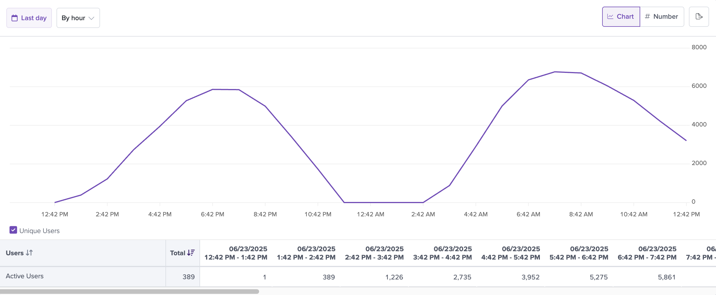
Unique Users
A timeseries of Unique Users allows you to keep track of the number of unique users of your application within the timeframe of your choice. You can also add filters to this chart to keep track of the unique users who have completed a particular action or match some criteria. Note that this chart measures users rather than sessions.
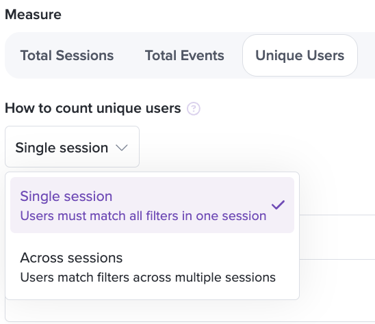
You can use this timeseries type to measure user behavior within a single session or across multiple sessions.
For example, assume you use the 'across multiple sessions' option and add a 'Clicked on 'Purchase' text' filter as well as a 'Visited URL contains 'cart'' filter to the chart.
This will match users who may have visited the 'cart' page and clicked on the 'purchase' button in different sessions - they may be browsing your site and checking the cart page today, but coming back to actually purchase in a different session tomorrow.
Alternatively, if you use these filters for the 'single session' option, this will only match users who have visited the 'cart' page and clicked the 'purchase' button within a single session.
Percentile / Sum / Average
This timeseries allow you to view percentiles, sums, and averages for various types of data and plot them over time. Leverage the Average / Sum / Percentile timeseries type to calculate things like average session length, average network request duration, average time between two events, total number of purchases, and more!
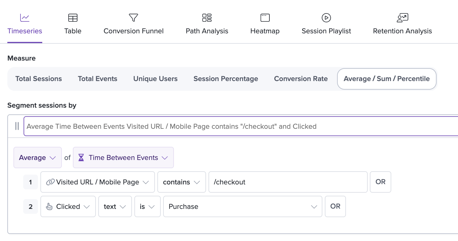
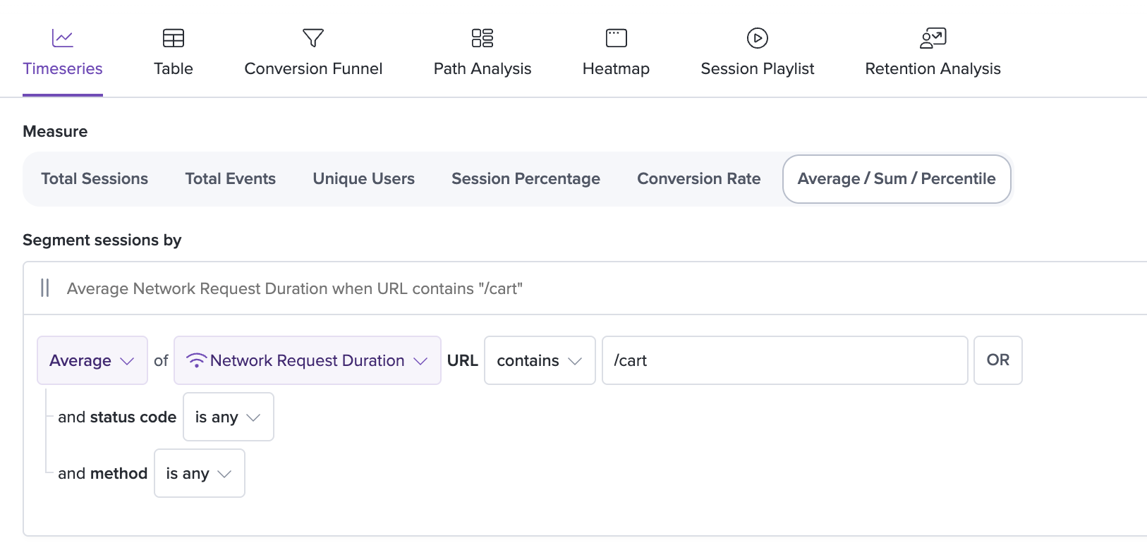
The available options include measurements of frontend performance within the application, such as Time Between Events and Network Request Duration, as well as user behavior metrics such as Time on Page.
For percentiles, you can choose to view the 50th, 90th, 95th, and 99th percentile levels for each type of measurement. Each level of percentile will give you different insight into the data points. For example, if you are interested in the median amount of time that users are spending on a page, you can choose to view the 50th percentile of the Time on Page metric. Or if you want to keep track of the performance of your network requests, you can use something like the 95th percentile to know that 95 percent of your network requests have a duration that is lower than what is displayed on the graph.
Sum is useful when combined with custom events that track revenue in order to understand the total revenue being generated in a week or month.
Average allows you to see the average time users are spending on a given page in a session and/or how long, on average it takes users to go from step 1 to step 2 in a funnel.
Network Request/Response Body
You can choose to create a percentile chart based on the value of a numeric property stored within a network request or response body.
Select the 'Network Request Body' or 'Network Response Body' from the Percentile timeseries and enter the property name you would like to track. This must be entered in JSON path dot notation (i.e. item.variables.price) and match the property exactly.
This percentile type is non-retroactive, meaning you must save the chart before data starts populating and any edits to the chart will reset the data stored.
Note that we cannot currently match property names that are nested in arrays.
Additionally, this percentile type is not supported for sessions recorded with our Mobile SDK.
Conversion Rate
A timeseries of Conversion Rate allows you to keep track of the historical conversion rate between two pages or steps over time.
Similar to the funnels, you can define specific steps based on click events, URL visits, and redux actions and view whether the conversion rate has been increasing or decreasing over time (specifically, whether users who completed the first step also completed the second step). This can give you insights into historical trends and whether, for example, specific marketing pushes or technical efforts have affected the conversion.
Session Percentage
The Session Percentage timeseries allows you to measure the number of sessions that have completed a certain action or fit a certain category (defined by the use of filters) and display it as a percentage of the total sessions at any specific point in time.
You can use the same Group By functionality described above for Total Sessions timeseries on this timeseries type as well.
Number View
View any Timeseries as a single number to display on your dashboard.
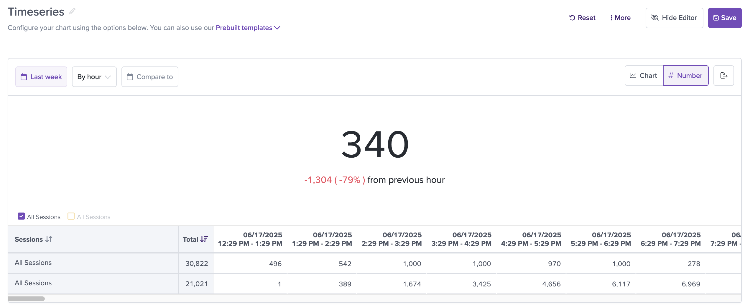
The number displayed is the value of the most recent complete interval, and it shows a comparison with the value of the interval before that.
For example, if you are viewing a Timeseries chart with a time range set of 1 week, and the interval is set to hourly, switching to the Number view will show you the value of the Timeseries in the most recent complete hour.
Time Range & Interval Settings
You can select the time range and interval for a timeseries and save the selection with the chart. For example, you may choose to see a count of users that were active in the last month by week.
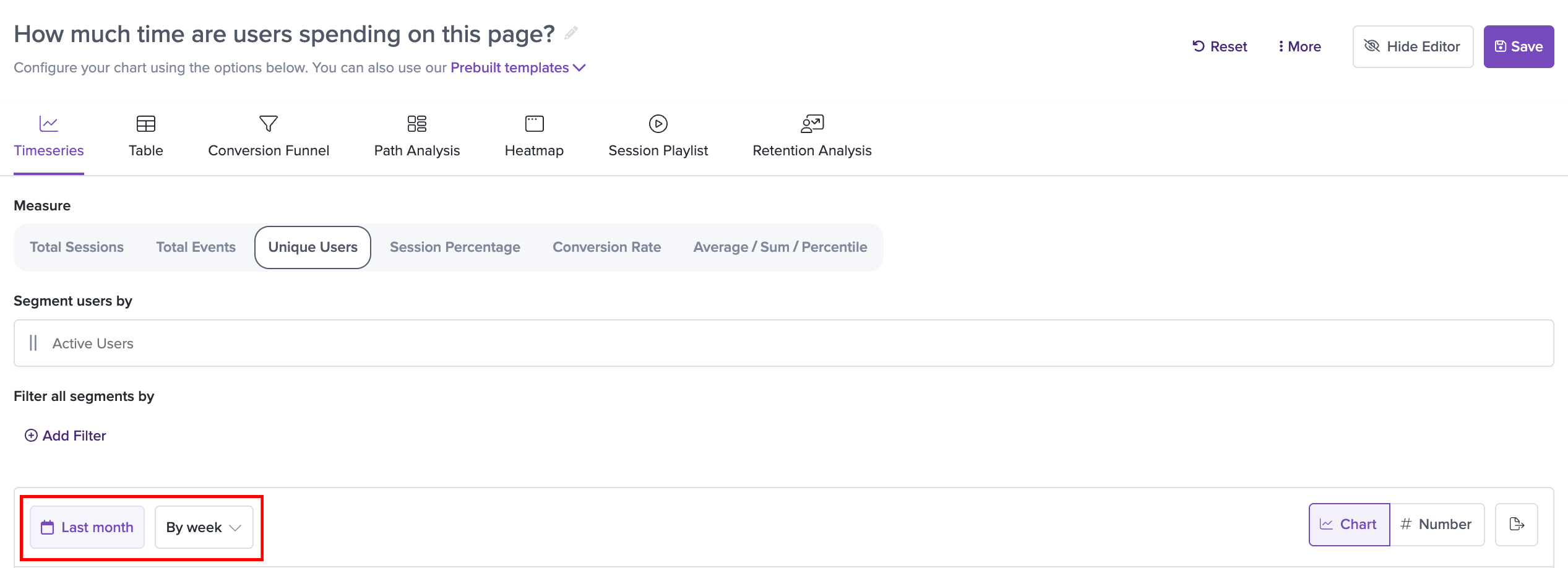
Alternatively you can use the "Entire Range" option to see the total count for the entire time range. The total count is also exposed in the "Total" column for easier access.
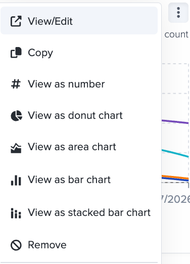
Other View Types
You can also choose to view Timeseries charts as Area Charts, Bar Charts, and Stacked Bar charts. See the menu of options at the top right of a chart:
Updated 17 days ago