

Tables
Overview
Tables allow you to view aggregate data elements for various pieces of information.
You can use these charts to answer questions such as "What is the session breakdown per browser?" and "What are the most commonly rage clicked elements in my app?"
To use these, simply select "Table" followed by the metric that you are interested in measuring.
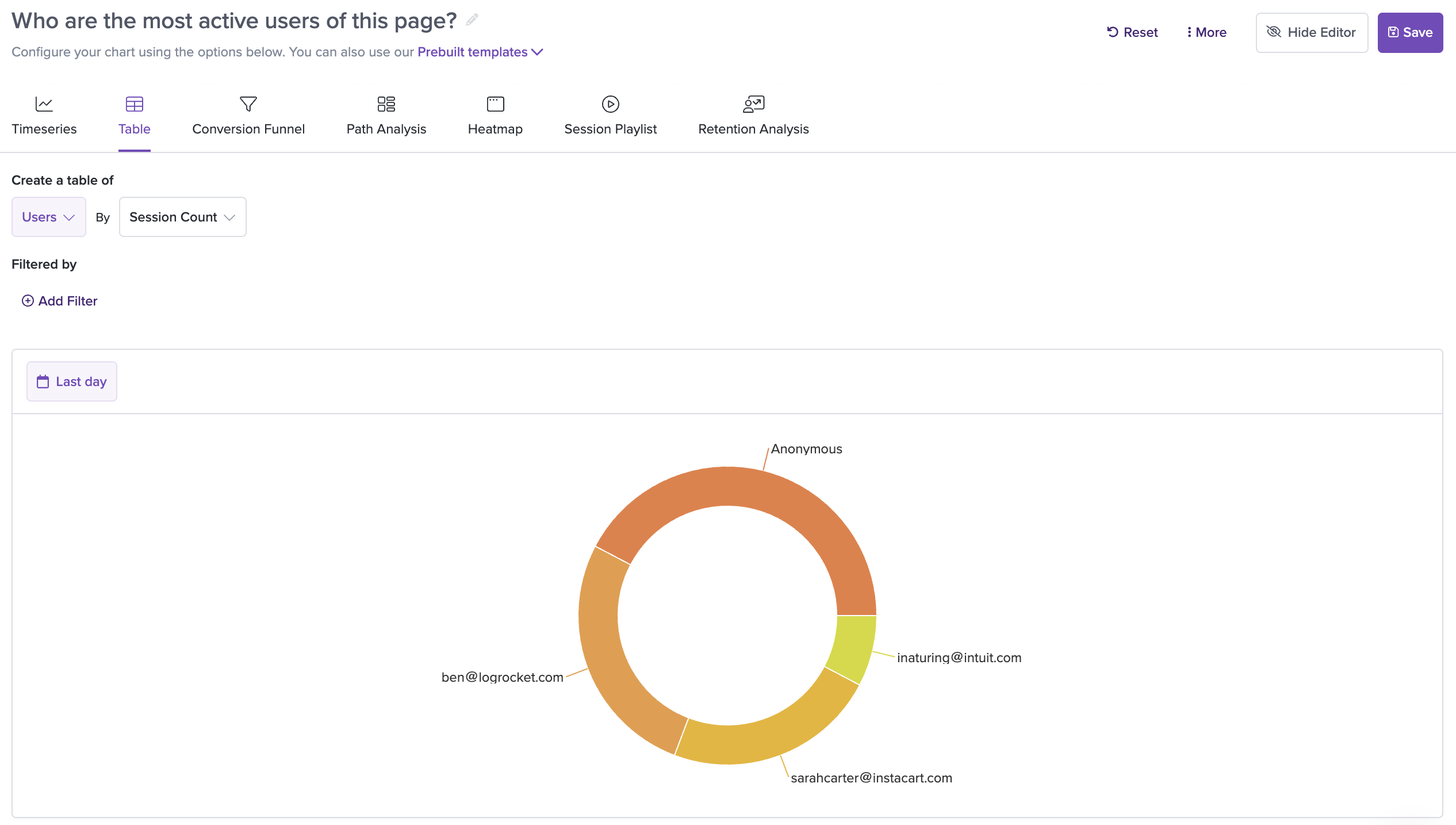
You can layer filters on top of the tables as well, for more granular insights.
After the table is saved, you'll see a list of different types on the lefthand side with the session count on the righthand side:
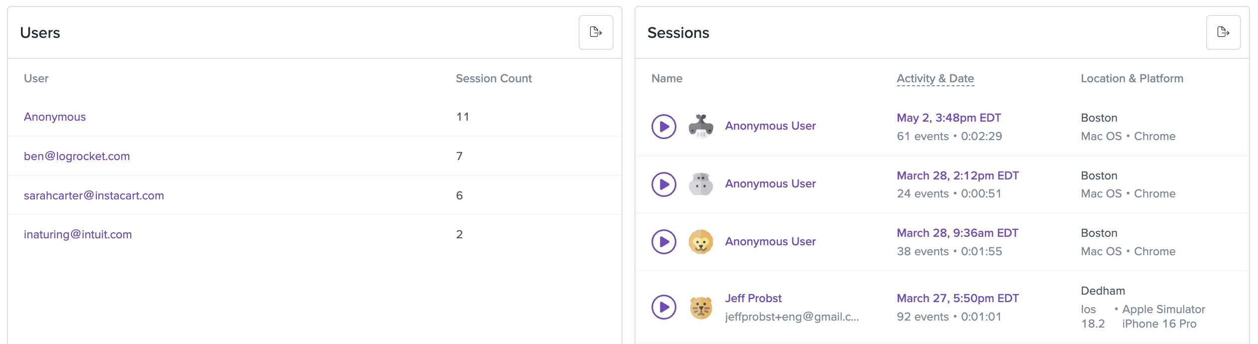
You can click each type on the left to filter the sessions displayed in the list on the right.
Donut Chart View
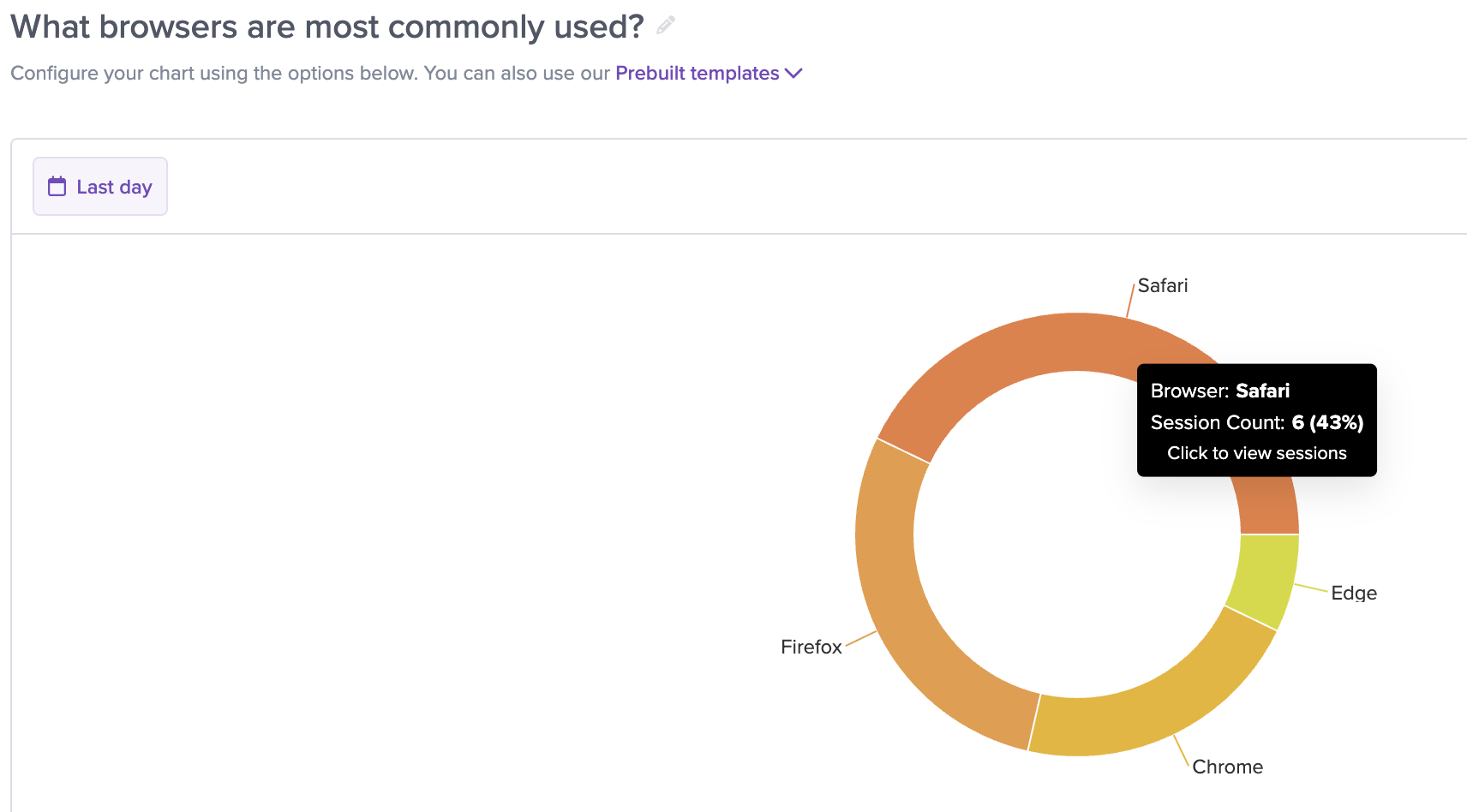
For most table types (excluding Network Request Durations, Initial Page Load Durations, and Issues), we support a Donut Chart view of the table.
This is automatically available within the full detail view for supported tables:
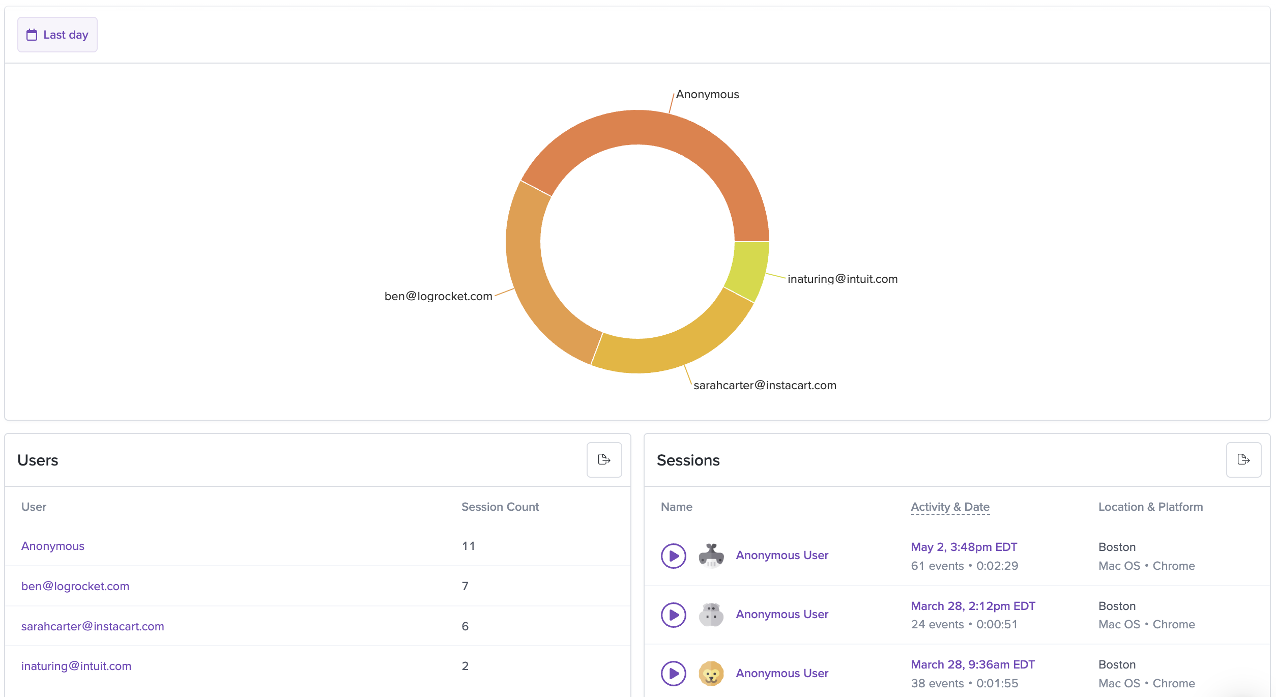
You'll see the donut chart at the top of the page, representing the top 20 elements in the table if the table contains more. You can hover over each section of the chart to see some additional data. Each section is also clickable, which will filter the session list on the bottom right to the relevant sessions.
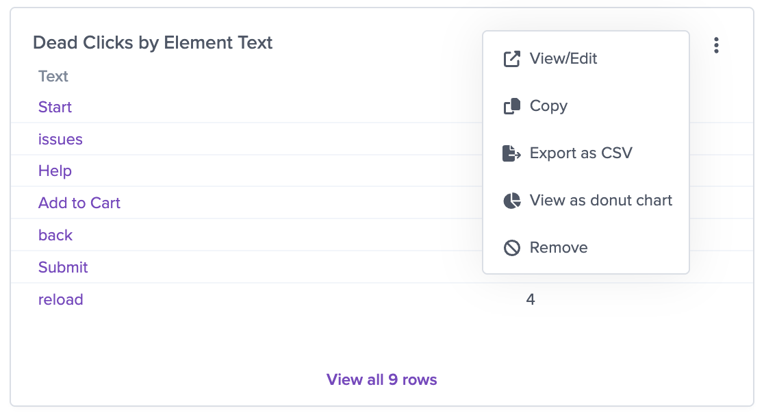
You can also choose to view certain table as a Donut Chart within a dashboard view. To toggle this, go to the Edit menu in the top righthand corner of the chart and click "View as donut chart".
You'll see the same data represented as a donut chart, with mouseovers giving you detailed data on each section of the chart.
Updated 11 months ago