

Creating Surveys
Everything you can do in the LogRocket survey builder, in one place.
If you just want to get a survey live quickly, start with Surveys Quick Start instead.
Opening the builder
Navigate to the Surveys tab in your LogRocket dashboard and click + Create Survey in the top-right corner. You'll first see the template picker.
Templates
LogRocket provides five pre-built templates to help you get started quickly, plus a "Start from scratch" option:
| Template | Steps | Types | When to use it |
|---|---|---|---|
| Product Feedback | 5 | Rating, choice, open text | Ongoing satisfaction measurement and improvement ideas |
| Onboarding Experience | 4 | Rating, choice, open text | Capturing friction points during setup and first-run |
| Feature Prioritization | 3 | ranking | Letting users vote on what to build next |
| Exit Survey | 3 | Choice, open text | Understanding reasons behind cancellations or downgrades |
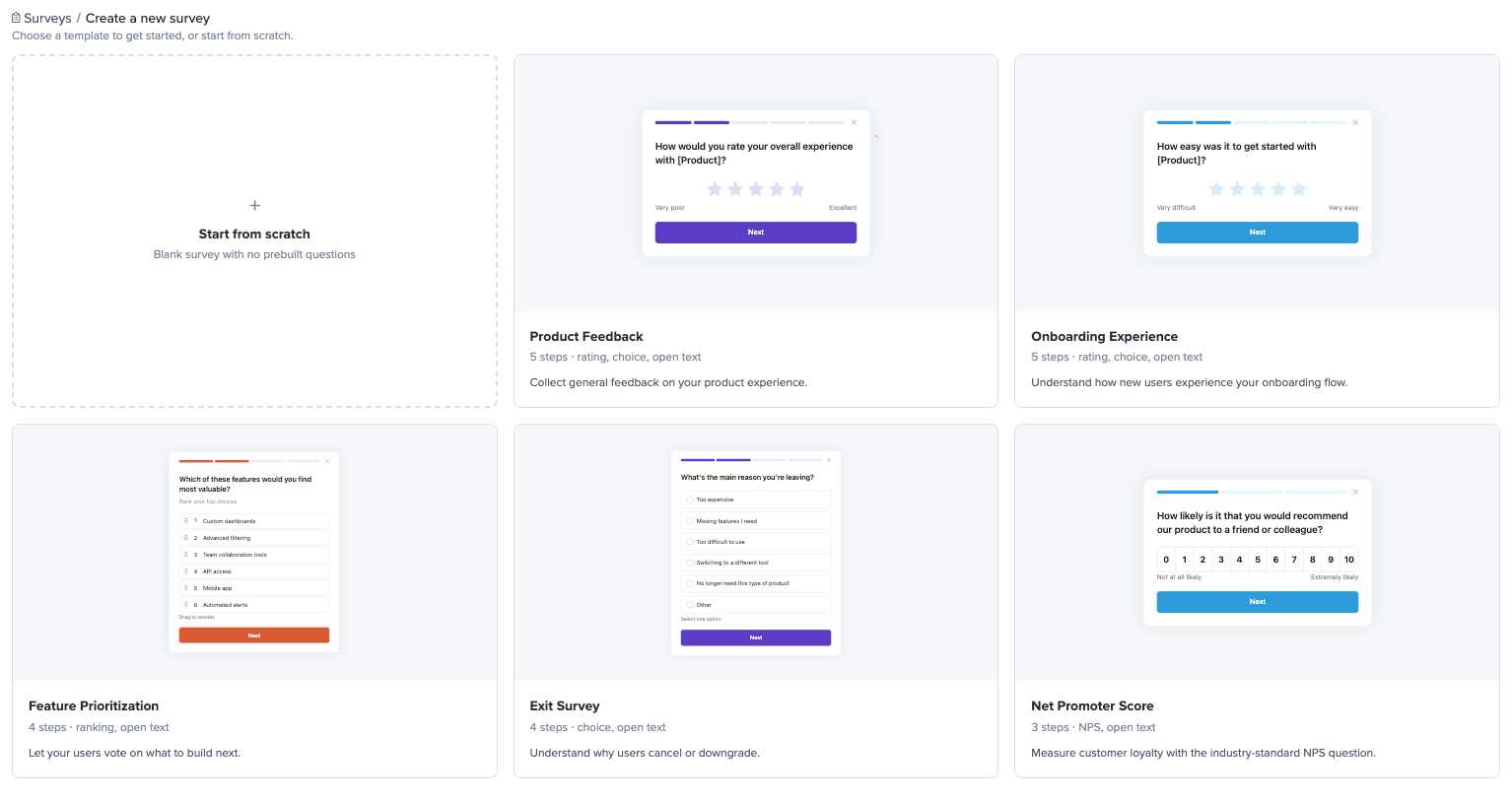
Each template comes pre-configured with questions, answer options, and suggested settings. You can use them as-is or customize everything — they're a starting point, not a constraint.
Choosing "Start from scratch" gives you a blank survey with a welcome screen and an end screen.
The builder layout
After picking a template (or starting from scratch), the builder opens with a Survey steps display on the left and four tabs across the top of the right sidebar
Build
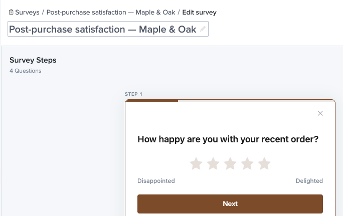
The Build tab is where you define your survey's content. A survey is made up of steps — a sequence of screens displayed to respondents one at a time. Steps can be questions (rating, choice, open text, etc.) or non-input screens (welcome screen, end screen).
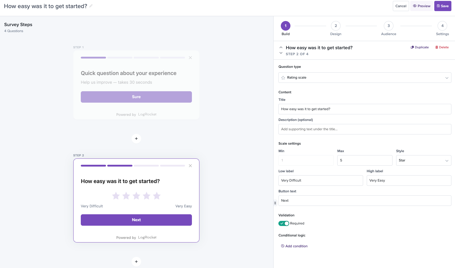
To add a step, click the + button between existing steps or use + Add Step at the bottom of the builder. You can drag steps to reorder them. To remove a step, click the x on the step card or use the Delete button in the right-hand panel.
For each step, select a question type from the dropdown in the right-hand panel. The available content fields (title, description, options, etc.) update based on the type you select.
Steps vs. questions
You'll notice the builder calls everything a "step" — including welcome screens, questions, and end screens. Throughout these docs, when we say "questions" we mean the steps that actually collect input: rating, NPS, single choice, multiple choice, open text, and ranking. Welcome and end screens are steps, but they're not questions and they don't count toward the 10-question limit.
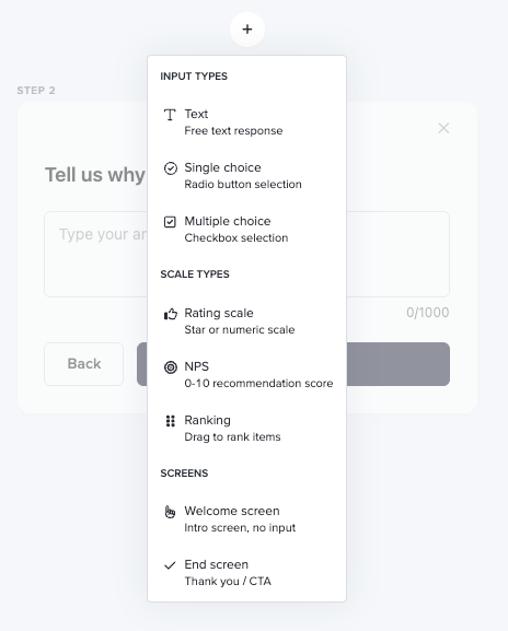
Step types
LogRocket supports six input question types plus two non-input screen types.
Non-question step types
These steps frame your survey but don't collect input. They don't count toward the 10-question limit.
Welcome screen — An introductory screen with no user input. Use it to set the tone and explain what the survey is about before the first question. You can customize three fields: title, description, and button text. The button text defaults to "Sure" but you might change it to "Get started" or "Let's go" depending on your tone.
End screen — A confirmation/thank-you screen shown after the final question. You can customize the headline, body text, and button label. Use this to let respondents know their feedback was received and optionally link them to a resource (the body text supports hyperlinks). The default message is "Thanks for your feedback!"
Question step types
These are the question types that collect responses from your users.
Rating — A star or numeric scale for quantitative feedback. Respondents select a value on the scale. You can configure the scale range — for example, 1–5 stars for a compact satisfaction check or 0–10 for a broader sentiment measure. The labels on each end of the scale are editable (e.g. "Terrible" / "Excellent").
Single choice — A set of radio button options where the respondent picks exactly one answer. You can add, remove, and reorder options inline in the builder. Use this for questions where the answers are mutually exclusive, like "What was the hardest part?" with options like "Installing the SDK," "Understanding the dashboard," "Setting up my first project," and "Nothing, it was easy."
Multiple choice — A set of checkbox options where the respondent can select one or more answers. Like single choice, you manage options inline. You can optionally enable an "Other" option that includes a free-text input, so respondents can provide an answer you didn't anticipate.
NPS — A purpose-built 0–10 Net Promoter Score question. It works like a rating question but comes pre-configured with standard NPS labels ("Not at all likely" / "Extremely likely") and automatic NPS scoring — Detractors (0–6), Passives (7–8), Promoters (9–10).
Open text — A free-form text area for qualitative feedback. You can set custom placeholder text and a character limit to keep responses focused.
Ranking — Respondents drag a set of items into their preferred order to capture relative preferences. You define 3–6 items to rank. The default order is randomized per respondent to reduce order bias, and items are numbered (1st, 2nd, 3rd…) based on their current position.
Multi-question surveys
Surveys can contain between 1 and 10 input questions (not counting the welcome and end screens). Questions are displayed one at a time with Next and Back navigation, so respondents are never overwhelmed by a wall of questions.
A progress indicator at the top of the survey shows how far along the respondent is. The style of this indicator (step dots, progress bar, or percentage) is configurable in the Design tab.
All responses from a single respondent are captured as one unified survey response, so you can see the complete picture in analytics — not just isolated answers.
Conditional questions
Conditional logic lets you show or skip questions based on a respondent's previous answers. This keeps surveys concise and relevant — a user who says everything was easy shouldn't be asked what went wrong.
To add a condition, click + Add condition below a question step in the builder.
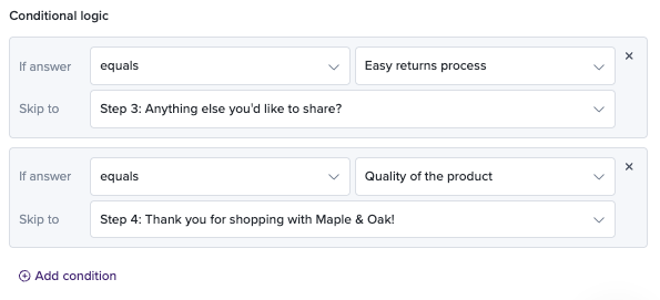
You can set conditions based on:
For single choice and multiple choice questions:
- Equals / Does not equal — exact match on a specific option
- Is answered / Is not answered — checks if there is or isn't an answer (if not required)
For rating and NPS questions:
- Is greater than / Is less than a specific value
- Equals / Does not equal — exact match on a specific value
- Is answered / Is not answered — checks if there is or isn't an answer (if not required)
If the condition isn't met, the question is skipped and the respondent moves on to the next applicable step. Skipped questions show up as blank in the individual response view.
Example: You have a 5-star rating question followed by an open text question titled "What could we improve?" You add a condition on the open text question: show only if Rating is less than 4. Users who rate 4 or 5 stars skip straight to the end screen, while users who rate 1–3 stars get a chance to explain what went wrong. This keeps the survey short for happy users while capturing actionable detail from frustrated ones.
Design
The Design tab is where you make the survey look like it belongs in your product. Changes show up in real time on the survey cards in the left panel, so you can see exactly what you're getting.
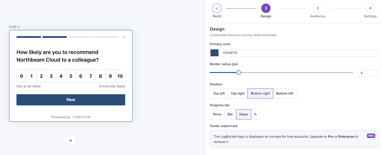
Primary color — The accent color used for buttons, selected states, and the progress bar. Click the swatch to open a picker, or type a hex code directly. This one setting does more than anything else to make the survey feel native to your product.
Border radius (px) — Controls how rounded the survey card corners are. Slide to 0 for sharp corners or increase for a softer look.
Position — Choose which corner of the screen the survey appears in: Top left, Top right, Bottom right (default), or Bottom left. Pick a corner that doesn't conflict with your app's existing UI elements (chat widgets, help buttons, etc.).
Progress bar — Select the progress indicator style shown to respondents: None, Bar (a horizontal fill bar), Steps (dot indicators), or Percentage (numeric %). We recommend Steps or Bar for surveys with 3+ questions — it reassures respondents that the survey is short.
Footer watermark — On Free plans, the "Powered by LogRocket" logo appears at the bottom of the survey widget. Upgrading to Pro or Enterprise removes it for a fully branded experience.
Audience
The Audience tab controls who sees your survey and when. If you don't set any filters here, the survey shows to everyone — which is fine for broad feedback. But the real power is in targeting.
Targeting filters
Add one or more filters to narrow down who sees the survey. Filters stack with AND logic, so all conditions must be true for a user to qualify.
Common filter examples:
- Visited URL contains "/pricing" — Target users browsing your pricing page
- Device type is Desktop — Limit to desktop users only
- User Trait — Target based on properties you set via the SDK's .identify() function (e.g. plan type, role, account age)
- Custom Event is completed_first_objective — Target users who do a specific action based on [custom events you send via the SDK's .track() function
- Clicked — Target users who click a specific element based on the element's selector text
You can combine multiple filters to create precise targeting. For example, to survey desktop users who just completed onboarding, you could stack a "Visited URL contains /dashboard" filter with a "User Trait" filter.
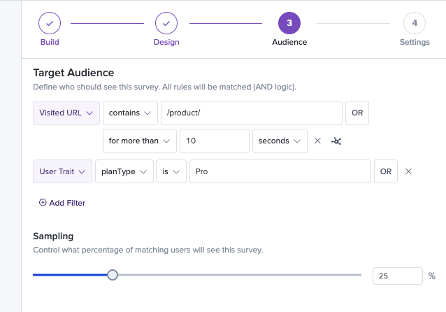
Targeting percentage
You can set a Targeting percentage to sample a fraction of the matching audience. For example, if your filters match 1,000 daily users and you set the percentage to 25%, approximately 250 users per day will see the survey. This is useful for testing a survey with a smaller group before rolling it out broadly, or for running surveys on high-traffic pages without surveying every visitor.
Settings
The Settings tab is where you configure notifications and other survey behavior.
Notifications
You can opt in to be notified about new survey submissions in two ways:
- Daily email summary — A digest of all new submissions from the past 24 hours, sent to the email address associated with your LogRocket account.
- Real-time Slack notifications — Immediate alerts in a Slack channel of your choice whenever a new response is submitted.
Naming your survey
Click the survey name at the top-left of the builder to rename it at any time. This is just for your team's reference — your users never see it.
Previewing
Click Preview in the builder header to see exactly what your users will see. You can step through every question, test your conditional logic branches, and make sure the design looks right — all before anything goes live.
Always preview before activating, especially if you're using conditional logic. It's easy to accidentally create a path that skips a question you meant to show, and catching it here is a lot better than catching it from a user's confused response.
Saving
Click Save in the top-right corner to save your survey. New surveys are saved in an Inactive state — they won't appear to users until you activate them.
Activating and deactivating
From the Surveys list, toggle the status switch next to any survey name to move it between Active and Inactive states. You can also click Pause Survey from the survey detail view.
- Active surveys appear to users who match your audience criteria (or all users, if no filters are set).
- Inactive surveys stop appearing to new users but all existing response data is preserved.
When you're ready to stop collecting responses — temporarily or permanently — simply toggle the survey to Inactive. You can reactivate it at any time.
Duplicating a survey
To create a variation of an existing survey without rebuilding from scratch, use the Duplicate action. You'll find it in the actions menu (three-dot icon) on the survey list row.
A duplicate copies everything: all questions, answer options, conditional logic rules, design settings, and audience filters. The new survey is named "[Original Name] (Copy)" and starts in an Inactive state with zero responses.
Handy for A/B testing different question phrasings, creating localized versions, or iterating on a survey's design without touching the one that's currently live.
Updated about 1 month ago